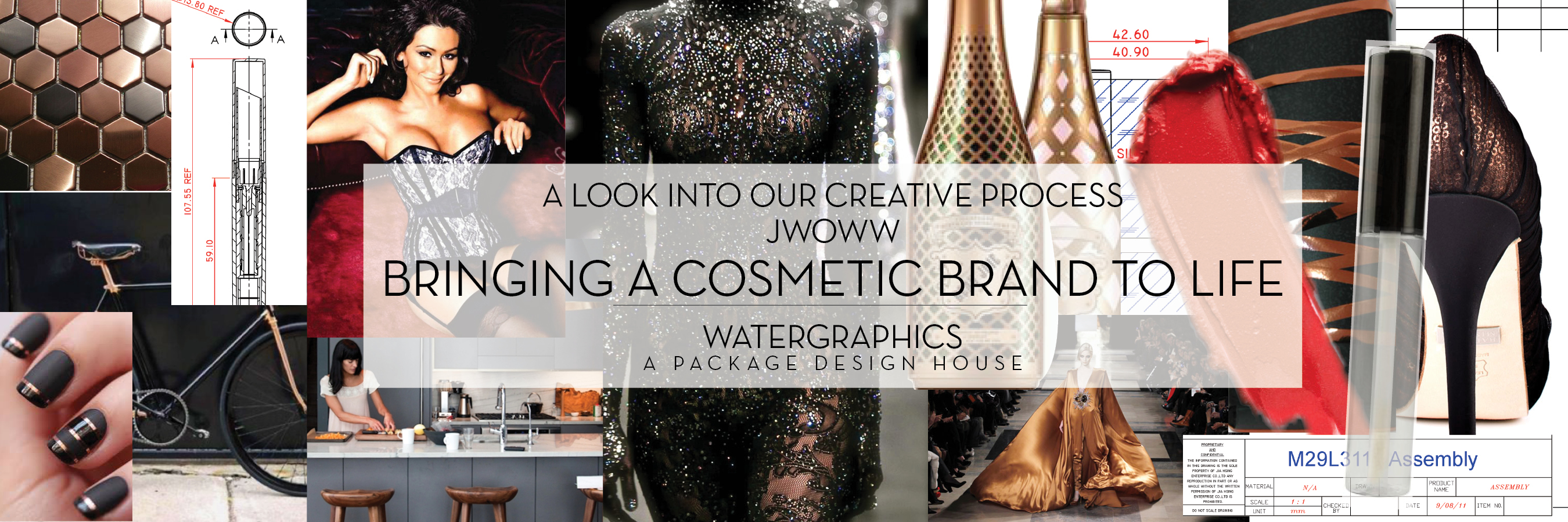
“That girl from Jersey Shore, Jwoww, wants a lip kit line,” Cosmetic Fulfillment & Packaging (CF&P) told me via Skype chat.
I had to Google JWOWW and school myself on who JWOWW is. Jenni Farley (AKA JWOWW) was one of the eight main cast members in the MTV reality series Jersey Shore. Cosmetic Fulfillment & Packaging (CF&P) partnered with Farley to create a cosmetic line. CF&P retained Watergraphics to design the branding and packaging.
The thing about Jenni that caught my attention was her fierceness/focus. The girl already had rock hard six-pack abs, just after having a baby. Plus, she had grown and matured since her days on Jersey Shore. I wanted to get all of that into her brand.
My perception of the Jersey Shore cast is that they’re famous for their golden bronze tans; at least one branding strategy was going to be all about copper. Plus, I am obsessed with copper. I go through several Krylon® Copper Metallic Paint cans every few months (picture frames, exposed pipes, metal tables –anything in my house that is paintable— watch out).
The idea was to push beyond the reality TV star image and focus on the quality and elegance of the product. The goal was to attract the target market outside of the reality TV show demographic, to reach women who are magnetized by fierce packaging and who love trying out the next amazing cosmetic.
Basically, I am that target demographic. I spit out all of my ideas: handcuffs, lace, corsets, flat matte black, infused with copper. I also asked for Jenni’s signature, because nothing establishes a brand quite like an individual’s signature.
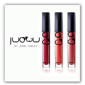
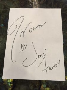
Farley’s signature was vectorized, made into a graphic and used as an icon-logo. Then, different graphics such as lace, corsets and handcuffs were used on the packaging-concepts as brand identifiers. My favorite was the lace and corset directions— I could just see so many things done with that. I even mocked up ads with lace and corset visuals to push them to lean towards that direction. The signature was a branding element but not the focus. I needed to get every single creative direction out of my head, placing all concepts into a mock-up. Then, I figured which ones to show the client and deleted the designs I wasn’t crazy about. I learned a long time ago, to never show the client something you do not like, because that will be the one they select.
JWOWW was misspelled on the first round concepts (leaving out the second “w” in Jwoww). Jenni simply pointed it out and she moved onto focusing on the design concepts. I was relieved because this reinforced that we were working with a pro; her ego was not involved, she was as focused on the branding and loving the look/feel.
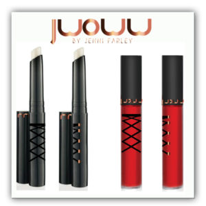
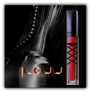
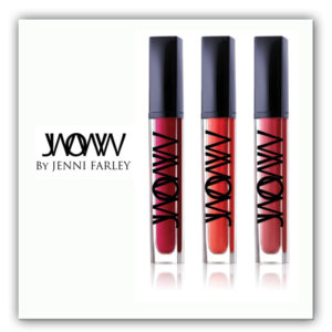
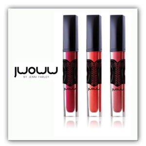
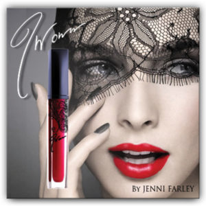
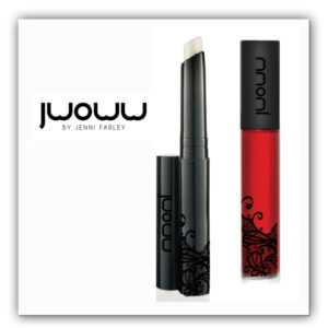

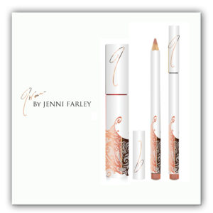
They went through four rounds of revisions. Each revision pass, the simple design with a “J” pulled from the signature and placed on the cap kept getting through to the next round. By the 4th round, lace, handcuffs, corset and type treatment of cross W’s” were all rejected and the winner was the signature –simplistic, clean and very identifiable.
Packaging was determined and artwork set into deco-line and uploaded to Asian container vendor to produce.
Next was the outer box creative. The box design is my favorite part of the process. You don’t really think about the box a cosmetic comes in, but it’s the first thing you see on a retail shelf and it’s the first thing you see when you open an online ordered shipping package. The box is totally key in creating a brand and establishing that user connection –it’s my favorite part.
![JWOWW_lip pencil_Careless Nude_10027 Rev A [Converted]](http://watergraphics.com/wp-content/uploads/2016/12/JWOWW_box-mockup-1-184x300.jpg) All of the bells and whistles were going to get into play in JWOWW’s box: varnish, dull varnish, spot varnish, metallic ink, metallic foil, emboss, and debossed, all to be presented to the client. Before showing the client, I met with Ryan Hartlief at Spectrum Packaging Corporation (box printer) to ensure each vision was realistic and doable (and not too expensive). The final selected design has metallic ink text and flood coating metallic on the inside. Copper foil was used on logo, front-copy and lid, plus an embossed graphic of the actual product on the front.
All of the bells and whistles were going to get into play in JWOWW’s box: varnish, dull varnish, spot varnish, metallic ink, metallic foil, emboss, and debossed, all to be presented to the client. Before showing the client, I met with Ryan Hartlief at Spectrum Packaging Corporation (box printer) to ensure each vision was realistic and doable (and not too expensive). The final selected design has metallic ink text and flood coating metallic on the inside. Copper foil was used on logo, front-copy and lid, plus an embossed graphic of the actual product on the front.
Using the signature as the main branding element on a flat matte black box with pop of copper— the trick was how to show the color of the product inside the container. CF&P had the idea of a swoosh. I needed to figure out how to create that in production ( a tough Adobe Illustrator problem). Embossing the swoosh to create a realistic feel when touched was the “sexy-sexy” (my catch phrase for all clients). After several trials and errors, with Spectrum Packaging, we figured out the ideal areas of the swoosh that should be raised. It had to be enough that they could make the die for it without the entire swoosh raised up because that is not realistic.
The end user should have her senses WOW’d. I believe we achieved it .
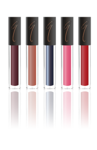
Jwoww cosmetics are now sold online, with new shades being introduced. (The boxes are so fabulous that you’ll need to order a set of lipstain and lip pencil to see and to hold in real life.)
Save
Save
Save
Save
Save
Save
