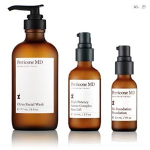
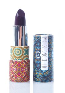
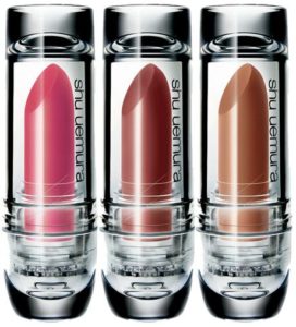
Your product packaging has two seconds to stake a claim, connect with the customer and earn closer examination. Packaging that fails the two-second test gets passed over in favor of a competitor that knew the 3 Strategies and how to use them.
1. 2-Second Test
The shopper evaluates your unique features and benefits relative to its price –in two seconds-WOAH!
Simplicity of the design is important as it makes it easy for consumers to make a quick decision.
Two Second Rule: If a shopper can fully absorb all the important visual images and text content of the front panel within two seconds, they feel a subconscious s
ense of accomplishment and completion. It’s as if they fully understand the product, what it has to offer, and appreciate its simplicity. If they have to commit more time than two seconds, the endeavor is immediately judged to be time-consuming, and your product is cast aside for one that knew what to say and how to say it in a fraction of the time. The key to closing the sale at the point-of-purchase is to get into the hands of the shopper first. The first product to be picked up is usually the product that makes it to checkout. The “less is more” philosophy will increase your chances of being selected first and converting the shopper to a customer.
2. Opposites Attract
On the retail shelf, when a shopper considers a category of product, their  eyes quickly scan the shelf and a mind storm of visual sensory data is evaluated in milliseconds.
The shopper’s mind is subconsciously looking for two m
ain things:\
- What they recognize as familiar.
- What stands out as different.
For repeat purchases, shoppers are focusing on what they recognize—that product they
However, being a follower has the innate allure of being safe. “If the other 3 competitors are using blue as their primary packaging color, then we should to
o.” The category leaders, instead, say “everyone else is blue, we are going to be red.”This is oversimplified, but you get it. Leaders aren’t worried who follows in the direction they head; they head there because they know the direction is right. Followers look for who seems to know where they are headed, and follow them. Which one will your product packaging be?

3. Dress to Impress
We can all relate to
the dating scene. This is like the personal relationship version of the retail shelf. Men and women gather in a location with the intent to evaluate each other based on visual appearance, body language and subtle cues that tell us who may be a good match for us.
Of course this is all superficial and no one can truly know another person until they develop a relationship, but the practice of surface evaluations directly relates to shopping in retail. Just as a 21-year old woman is usually looking for a person of similar age and personality traits she can relate with, so are shoppers looking for products that appeal to their sensibilities and personality. If you are looking for a one-night stand, the less clothing the better, right? But if you are looking for a long-term relationship, a bit more modest attire may be more desirable. The first says “sex now,” whereas the second says “I’m looking for a relationship that lasts longer than 24 hours.” No product can be all things to all people. This is another common trap less experienced manufacturers and marketers believe about their products. I can’t tell you how often we have been presented with a product that, according to the marketing team, is purchased by women 70% of the time, but the manufacturer doesn’t want to alienate male purchasers so they direct us to make the packaging design appeal to both.
Products that try to be all things to all people end up meaning nothing to anyone. If your customer is an 18 to 30-year-old female, consider language and visual styles millennials can relate to. Use recyclable packaging with more natural tactile qualities since younger millennials value a lower carbon footprint and favor more natural packaging materials. If your target customer is men age 40-65, be sure to use larger fonts, short, clear benefit statements and more rigid packaging that makes men feel the product is stronger and will last. Whomever your target customer is, dress your packaging to impress them and attract their attention. If you packaging design ends up looking like a bedazzled men’s suit, be sure that’s the message you really want to send.
Kimberly Head is the director of agency, Watergraphics, serving health and beauty brands around the World with creative, practical and effective branding and packaging design.
